ATK Reviews
With the rebrand of the Review team (formerly Tastings & Testings team), they needed a new destination
the team: Kate Tetreault, director of UX; Tabitha Rodrigue, design director; and Olivia Sheldon, product designer
Overview
-
The team’s new name, ATK Reviews, came with some new philosophical and logistical changes. They would be publishing from a singular team voice, they would be publishing more content more frequently, and their stories would package more process, education, and nuance with the ultimate purchase recommendation.
The theme of more integrated storytelling was one that came up again and again. For a combo plate of legacy-related reasons, Reviews content was split up across the board. Taste Tests had a separate (and criminally under-visited) browse experience from Equipment Reviews; a product’s in-depth chart of purchase recommendations was on a totally different page from the robust and compelling storytelling that revealed its unique testing process. The site was enabling one lone user journey: “I know I want to buy a slow-cooker. I search ‘slow cooker’. I find the recommended one and click the buy button.” This limited and transactional flow was underserving both our wildly curious users *and* our Reviews Team.
-
Reflect ATK Reviews team rebrand and mission evolution
Support our users’ mental model for discovery and targeted browsing of ingredients and equipment
Support aggressive affiliate revenue goals
-
The project was a communication-heavy one. We lead co-design workshops with the Reviews Team, and navigated two very different processes and work styles coming together. We leaned on our Co-Design Panel of home cooks to support research and usability tests, including a Zoom card sort!
Ultimately, we delivered a top-to-bottom new experience for the Reviews Team and for our users.
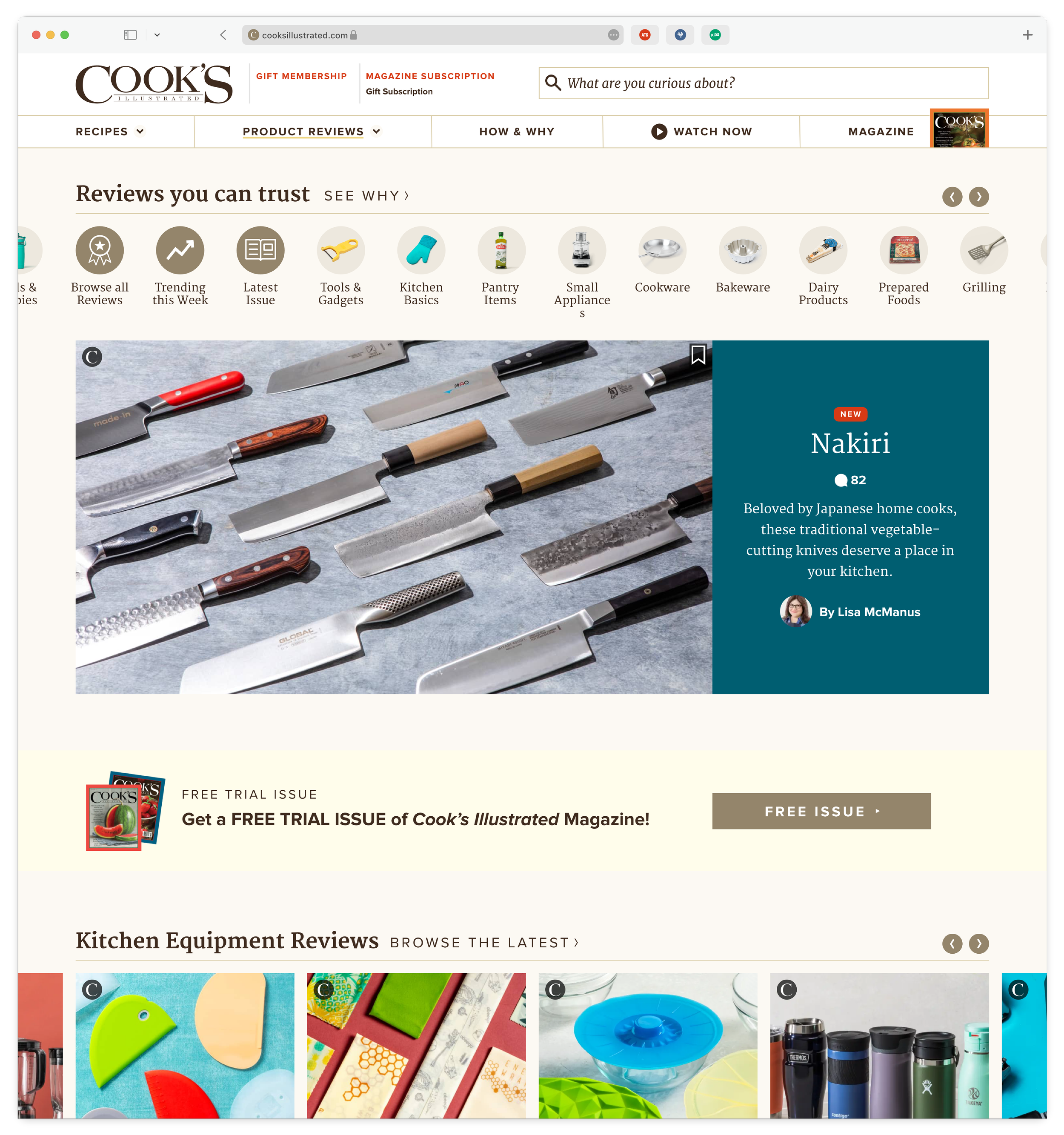
A new landing page puts the editorial voice front and center, and gives a shared home to taste tests, equipment reviews, buying guides and articles. A departure from the ‘card catalog’ approach of the past, the new system prioritizes discovery and gives editors CMS tools to curate content that speaks directly to user needs and motivations. And does so exclusively using our design system, Mise UI!
America’s Test Kitchen Themed Reviews Page
Cook’s Country Themed Reviews Page
Cook’s Illustrated Themed Reviews Page
Mobile experience


